Form
The Form is the primary container for user input. It consists of three sections:
- Header — an optional header element (e.g. a
CardHeader) - Form fields — input elements laid out in a column
- ActionPanel — a panel with actions for the form
All form fields are controlled. This means:
- The component holds the “source of truth” in its state (e.g.
useState) - The field's
valuecomes from that state - The field's
onChangeupdates that state
| Property | Description | Type | Default | Required |
|---|---|---|---|---|
children | The form input fields | React.ReactNode | — | Yes |
actions | A reference to an ActionPanel | React.ReactNode | — | No |
header | Header element | React.ReactNode | — | No |
Usage
Wrap your input fields and actions within the Form component to create a structured interface:
import { useState } from "react";
import { Form, Action, ActionPanel } from "@eney/api";

function MyForm() {
  const [name, setName] = useState("");

  function onSubmit() {
    // handle form submit
  }

  const actions = (
    <ActionPanel>
      <Action.SubmitForm title="Submit" onSubmit={onSubmit} />
    </ActionPanel>
  );

  return (
    <Form actions={actions}>
      <Form.TextField
        name="name"
        label="Name"
        value={name}
        onChange={setName}
      />
    </Form>
  );
}
Form.TextField
Use for single-line text input.

Properties
| Property | Description | Type | Default | Required |
|---|---|---|---|---|
name | Unique name of the form field | string | — | Yes |
value | The current value of the field | string | "" | No |
onChange | Callback triggered when the value changes | (value: string) => void | — | Yes |
label | The label displayed for the field | string | — | No |
isCopyable | Adds a copy button to the field | boolean | — | No |
Usage
Create a standard text input by linking the value and onChange props to your component's state:
import { useState } from "react";
import { Form } from "@eney/api";

function MyWidget() {
  const [city, setCity] = useState("");

  return (
    <Form>
      <Form.TextField
        name="city"
        label="City"
        value={city}
        onChange={setCity}
      />
    </Form>
  );
}
Form.NumberField
Numeric input with optional min/max bounds.

Properties
| Property | Description | Type | Default | Required |
|---|---|---|---|---|
name | Unique name of the form field | string | — | Yes |
value | The current value of the field | number | null | 0 | No |
onChange | Callback triggered when the value changes | (value: number | null) => void | — | Yes |
label | The label displayed for the field | string | — | No |
min | Minimum allowed value | number | — | No |
max | Maximum allowed value | number | — | No |
Usage
Set up a numeric input field with a defined range:
import { useState } from "react";
import { Form } from "@eney/api";

function MyWidget() {
  const [quantity, setQuantity] = useState<number | null>(1);

  return (
    <Form>
      <Form.NumberField
        name="quantity"
        label="Quantity"
        value={quantity}
        onChange={setQuantity}
        min={1}
        max={100}
      />
    </Form>
  );
}
Form.PasswordField
Masked text input for sensitive values.

Properties
| Property | Description | Type | Default | Required |
|---|---|---|---|---|
name | Unique name of the form field | string | — | Yes |
value | The current value of the field | string | "" | No |
onChange | Callback triggered when the value changes | (value: string) => void | — | Yes |
label | The label displayed for the field | string | — | No |
Usage
import { useState } from "react";
import { Form } from "@eney/api";
function MyWidget() {
const [apiKey, setApiKey] = useState("");
return (
<Form>
<Form.PasswordField
name="apiKey"
label="API Key"
value={apiKey}
onChange={setApiKey}
/>
</Form>
);
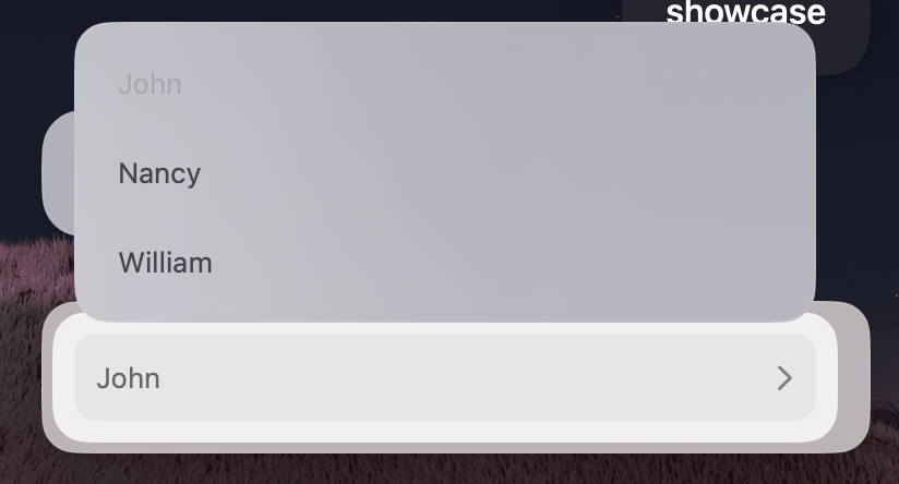
}Form.Dropdown
Provides a selection menu for users. Functions as a standard drop-down list by default. When searchable is true, as a searchable autocomplete field.

Properties
| Property | Description | Type | Default | Required |
|---|---|---|---|---|
name | Unique name of the form field | string | — | Yes |
value | The current selected value | string | — | No |
onChange | Callback triggered when the value changes | (value: string) => void | — | Yes |
label | The label displayed for the field | string | — | No |
searchable | Enables a search field with autocomplete suggestions | boolean | false | No |
children | Form.Dropdown.Item elements | React.ReactNode | — | Yes |
Form.Dropdown.Item
Use Form.Dropdown.Item to define individual selectable options within a Form.Dropdown list.
Properties
| Property | Description | Type | Default | Required |
|---|---|---|---|---|
value | Unique value of the dropdown item | string | — | Yes |
title | The title displayed for the item | string | — | Yes |
Usage
Populate your dropdown by adding multiple items with unique values:
import { useState } from "react";
import { Form } from "@eney/api";

function MyWidget() {
  const [currency, setCurrency] = useState("usd");

  return (
    <Form>
      <Form.Dropdown
        name="currency"
        label="Currency"
        value={currency}
        onChange={setCurrency}
      >
        <Form.Dropdown.Item value="usd" title="USD" />
        <Form.Dropdown.Item value="eur" title="EUR" />
        <Form.Dropdown.Item value="uah" title="UAH" />
        <Form.Dropdown.Item value="pln" title="PLN" />
      </Form.Dropdown>
    </Form>
  );
}
Form.Checkbox
Toggle input that can be displayed as a checkbox or a switch.

Properties
| Property | Description | Type | Default | Required |
|---|---|---|---|---|
name | Unique name of the form field | string | — | Yes |
label | The label displayed for the field | string | — | Yes |
checked | The current state of the checkbox | boolean | — | Yes |
onChange | Callback triggered when the value changes | (value: boolean) => void | — | Yes |
variant | Display variant | "checkbox" | "switch" | "checkbox" | No |
Usage
Add a simple switch to your form to handle boolean settings:
import { useState } from "react";
import { Form } from "@eney/api";

function MyWidget() {
  const [enabled, setEnabled] = useState(false);

  return (
    <Form>
      <Form.Checkbox
        name="notifications"
        label="Enable notifications"
        checked={enabled}
        onChange={setEnabled}
        variant="switch"
      />
    </Form>
  );
}
Form.DatePicker
Allows users to select a specific date, time, or both.

Properties
| Property | Description | Type | Default | Required |
|---|---|---|---|---|
name | Unique name of the form field | string | — | Yes |
label | The label displayed for the field | string | — | Yes |
value | The current date value | Date | — | Yes |
onChange | Callback triggered when the value changes | (value: Date) => void | — | Yes |
type | The types of date components the user can pick | "date" | "time" | "datetime" | "datetime" | No |
Usage
import { useState } from "react";
import { Form, Paper, Action, ActionPanel } from "@eney/api";
function CountdownWidget() {
const [date, setDate] = useState<Date>(new Date());
const [result, setResult] = useState<string | undefined>();
function onSubmit() {
const now = new Date();
const delta = date.getTime() - now.getTime();
const days = Math.floor(delta / (1000 * 60 * 60 * 24));
setResult(`${days} days remaining`);
}
return (
<Form
actions={
<ActionPanel>
<Action.SubmitForm title="Calculate" onSubmit={onSubmit} />
</ActionPanel>
}
>
<Form.DatePicker
name="date"
label="Target date"
value={date}
onChange={setDate}
type="date"
/>
{result && <Paper markdown={result} />}
</Form>
);
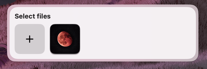
}Form.FilePicker
Allows users to select files from their Mac. Supports both single and multiple file selections.
Users may delete or move files after selecting them, but before the form is submitted. Always verify that files still exist before your extension acts on them.
Properties
| Property | Description | Type | Default | Required |
|---|---|---|---|---|
name | Unique name of the form field | string | — | Yes |
label | The label displayed for the field | string | — | No |
value | Current file path(s). Expects an array if multiple is true | string | string[] | — | No |
onChange | Callback triggered when selection changes | (value: string | string[]) => void | — | Yes |
multiple | Allow selecting multiple files | boolean | false | No |
accept | Uniform Type Identifiers to filter by type | string[] | — | No |
Usage
import { useState } from "react";
import { Form } from "@eney/api";
function MyWidget() {
const [files, setFiles] = useState<string[]>([]);
return (
<Form>
<Form.FilePicker
name="attachments"
label="Select files"
value={files}
onChange={setFiles}
multiple
/>
</Form>
);
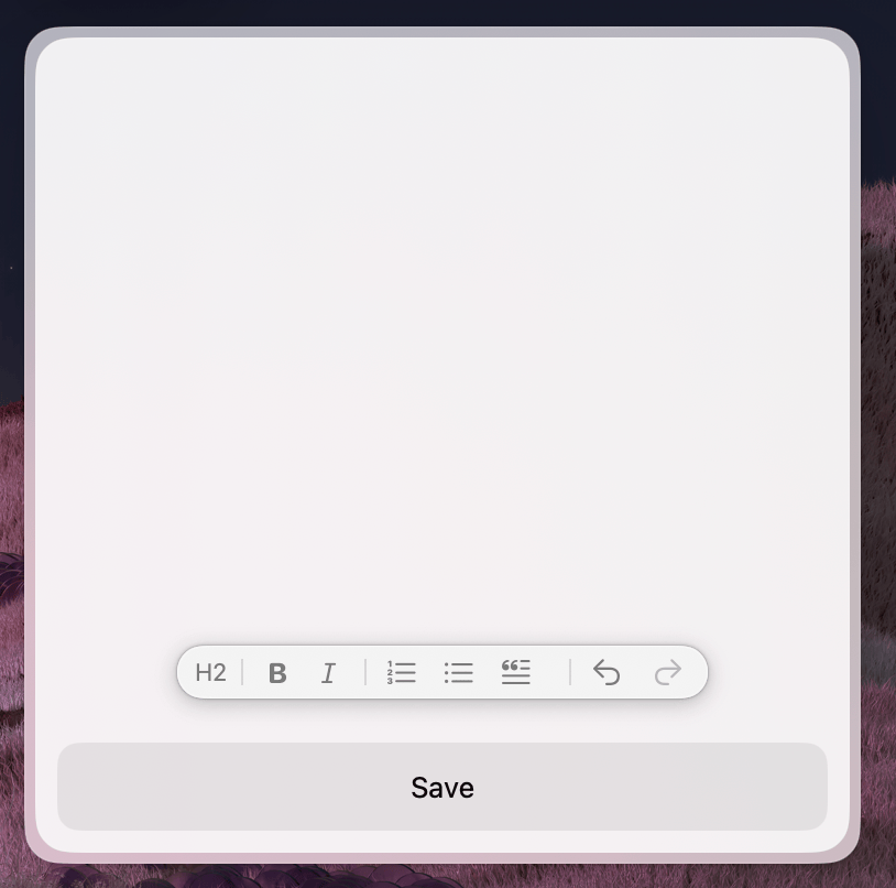
}Form.RichTextEditor
Provides a multi-line input field that supports rich text formatting, such as bolding, lists, and headers.
Properties
| Property | Description | Type | Default | Required |
|---|---|---|---|---|
value | The current text content | string | "" | No |
onChange | Callback triggered when the content changes | (value: string) => void | — | Yes |
isInitiallyFocused | Whether the editor receives focus on mount | boolean | — | No |
Usage
import { useState } from "react";
import { Form, Action, ActionPanel } from "@eney/api";

function NoteEditor() {
  const [content, setContent] = useState("");

  function onSubmit() {
    // process content
  }

  return (
    <Form
      actions={
        <ActionPanel>
          <Action.SubmitForm title="Save" onSubmit={onSubmit} />
        </ActionPanel>
      }
    >
      <Form.RichTextEditor
        value={content}
        onChange={setContent}
        isInitiallyFocused
      />
    </Form>
  );
}